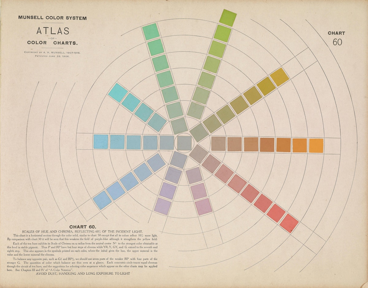
Before publishing his Atlas in 1915, painter and art teacher Albert Henry Munsell (1858–1918) had spent decades seeking to compress the totality of human color experience into a simple and elegant three-dimensional graphical model. In 1879, after reading physicist Ogden Rood’s Modern Chromatics, he devised a pair of twirling triangular color pyramids joined at the base. In 1898, he painted a child’s globe in subtly shifting shades, only to find that the globe’s perfect symmetry could not sufficiently map the differences in strength — which he called “chroma” — between colors or “hues”. By 1905, in his A Color Notation, Munsell had moved to a tree as model, since its unequal length branches could accommodate different hues, chroma, and “value”, the third axis of his system, which ran vertically from the pure white crown of the tree to its pure black roots.
In the Atlas, the Color Tree and Color Sphere give way to cross-sectional charts by which the user is meant to imaginatively assemble a “realistic” system of alphanumeric notation. Each individual color square represents the intersection of hue, value, and chroma, denoted by a three-part code. Munsell’s system turned Vermilion into “5R4/10” — “5R” denoted the fifth step in the red scale (R as one of five color initials); “4” denoted the fourth step in the value scale, and “10” indicated that the color had the maximum chroma/strength. Vermilion’s complementary color, Viridian, was expressed as BG4/5.
Besides “Red”, “Yellow”, Green”, “Blue”, and “Purple” — Munsell’s five principal hues, which overturned the prevailing dogma of three “primary” colors (red/yellow/blue) — “Vermilion” and “Viridian” are the only two specific color names that appear in the Atlas. Indeed, Munsell’s motivation for creating his system lay largely in his animus against the mushrooming chromatic vocabulary impelled by the fin-de-siècle commercial expansion of colors employed in advertising, manufacturing, fashion, and home décor. “Baby blue, peacock blue, Nile green, apple green, lemon yellow, straw yellow, rose pink, heliotrope, royal purple, Magenta, Solferino, plum, and automobile”, protested Munsell, “are popular terms, conveying different ideas to different persons and utterly failing to define colors.” Munsell envisioned a system akin to musical notation, which conveyed a sound’s pitch, intensity, and duration “without dragging in loose allusions to the endlessly varying sounds of nature”. {read}
